Cached at:
05/26/26, 06:56 PM
# A few interesting modern pixel fonts – Unsung
Source: [https://unsung.aresluna.org/a-few-interesting-modern-pixel-fonts/](https://unsung.aresluna.org/a-few-interesting-modern-pixel-fonts/)
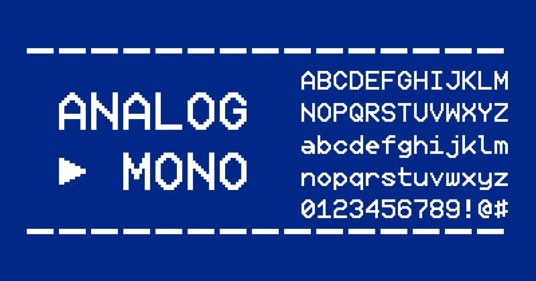
Andrew Gleeson designed[Analog Mono](https://gleeson.itch.io/analog-mono), “fixing the crimes of VCR OSD Mono\.” There used to be this classic pixel font that you’d see everywhere in the 1990s on hi\-fi equipment: VCRs, TVs, camcorders, etc\. One of its challenges was a low baseline which resulted in all the letters with descenders pulled up, for example:
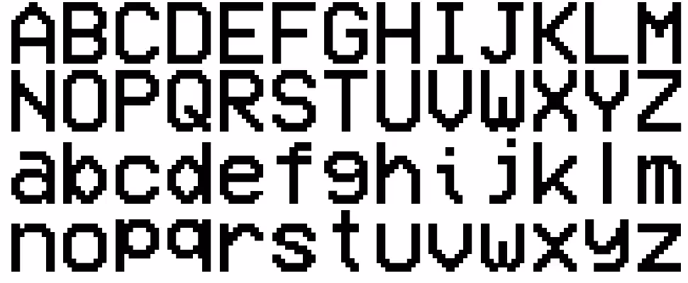Analog Mono fixes that problem:
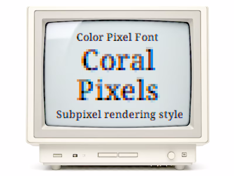
Elsewhere, Kumiko Yoshida made[Coral Pixels](https://github.com/tanukifont/Coral-Pixels)\(also on[Google Fonts](https://fonts.google.com/specimen/Coral+Pixels?preview.script=Latn)\), a color font that comes with the 1990s and 2000s colorful fringing baked in\. The fringing was once an artifact of subpixel rendering, but now it is meant to evoke nostalgia or just as an interesting visual element in and of itself\. \(Perhaps adjacent to chromatic aberration?\)
Lastly,[here’s Two Slice](https://joefatula.com/twoslice.html)by Joseph Fatula – a font that’s only 2 pixels tall, “and somewhat readable\.”
Of course, these are all vector fonts – e\.g\. ready to be installed on a modern operating system – pretending to be pixel fonts\. That’s maybe a separate post altogether, but it leads us to the last font,[Geist Pixel from Vercel](https://vercel.com/blog/introducing-geist-pixel):
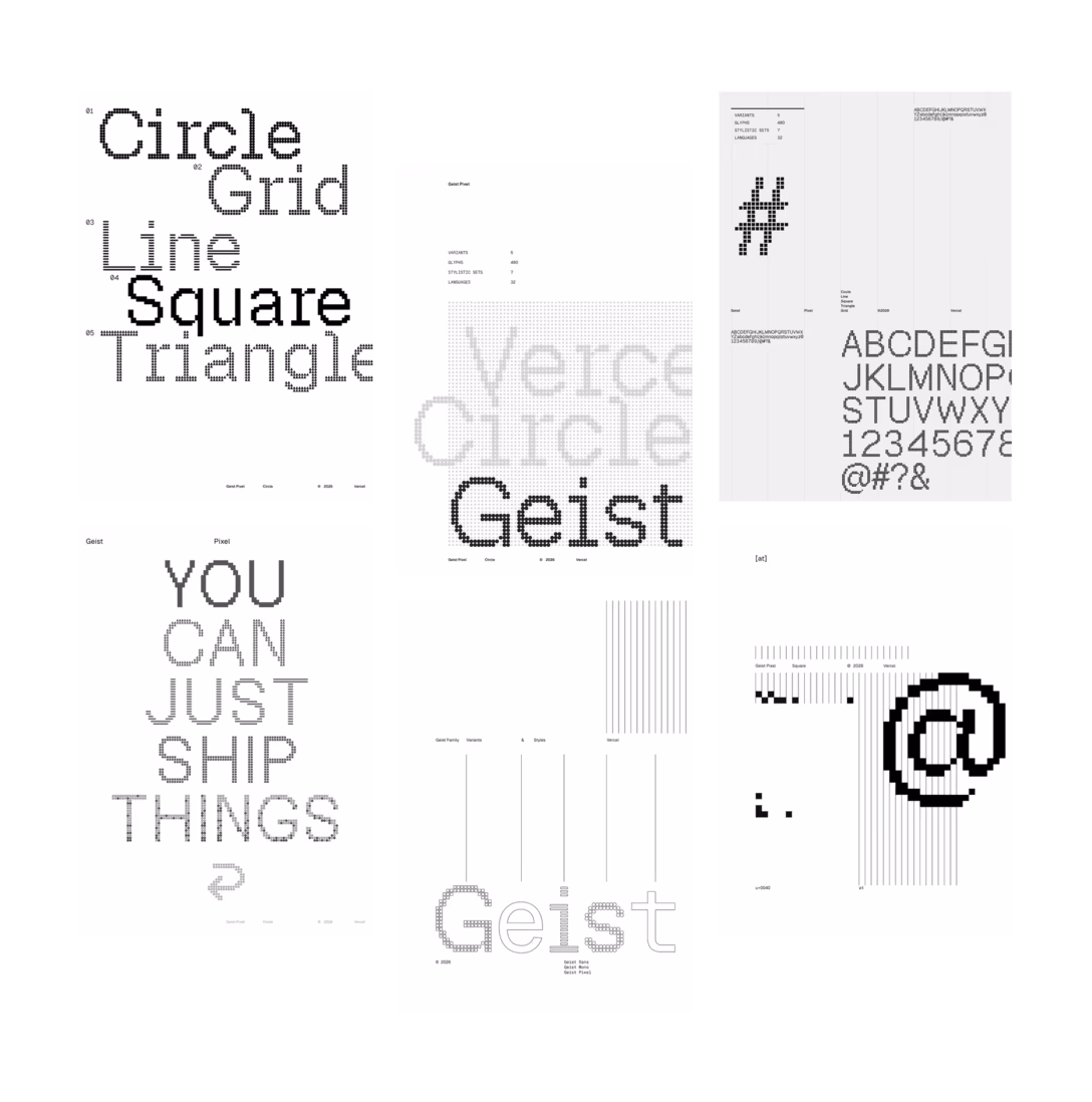The copy introducing the font is a little pretentious/spicy, but it touches upon something important:
> Geist Pixel isn’t a novelty font\. It’s a system extension\. \[… It\] was designed with real usage in mind, not as a visual gimmick, but as a functional tool within a broader typographic system\. \[…\] This matters because pixel fonts often break in production\. They don’t scale properly across viewports, their metrics conflict with existing typography, or they’re purely decorative\. Geist Pixel was built to solve these problems, maintaining the visual texture teams want while preserving the typographic rigor products require\.
There*are*definitely fonts whose Achilles’ heel is not the letterforms, but the invisible hard work put into everything that surrounds them: the kerning, the metadata, the extra glyphs, the vertical metrics\. It seems that the team being Geist Pixel is proud of especially that last part\.