Cached at:
06/08/26, 06:18 PM
# Good type against all odds – Unsung
Source: [https://unsung.aresluna.org/good-type-against-all-odds/](https://unsung.aresluna.org/good-type-against-all-odds/)
This is not italics\. This is not even[oblique](https://en.wikipedia.org/wiki/Oblique_type)\. This is a side effect of how those displays work\. Instead of a whole rectangle of pixels being changed at once, the display is updated line by line, starting from the top one\. As it’s moving towards the bottom, the internal horizontal position might have already advanced, the subsequent lines will be drawn slightly to the left, and it all leads to a slanted appearance\. \(This is in effect the same problem as[rolling shutter](https://en.wikipedia.org/wiki/Rolling_shutter)in photography\.\)
The interesting thing is that it could’ve gone the other way\. Twice\. In English or German, we treat scrolling left to be natural, and we consider only one direction of italic slant appropriate\. The first has to do with the direction of reading\. I believe the second is, like many things in typography, customary; there’s nothing inherently better than right\-leaning letters, except we’re used to them since those are the only ones we ever see\.
But, the person putting it all together could’ve just as well done it the other way: scrolling to the right, or slanting to the left \(by updating the display bottom to top – not as unusual as you might think\!\)\. Were those intentional choices, or was it a default? I’m not sure, but it points to the value of knowing this stuff, or creating a culture where this stuff is treasured\. Often, more craft will require more work\. Sometimes, however, you will get it for free – but only if you choose the right fork in the road\.
While we’re here, how about a few other examples of delightful moments in typography where I did not expect them? These, I believe, will be all intentional\. But whether you consider them craft, or even good, I don’t know\.
Here are some surprising small caps:
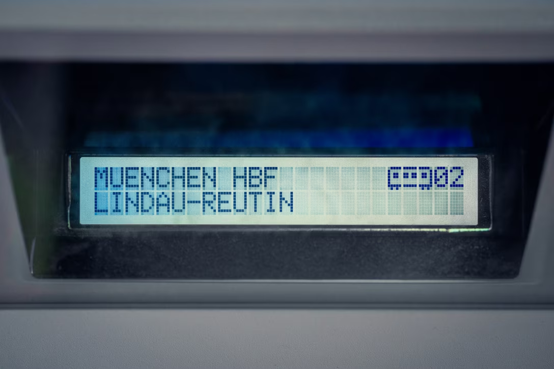
Here’s a cute depiction of a train carriage, somewhat hampered by the limitations of a similar workhorse 5×7 pixel font display:
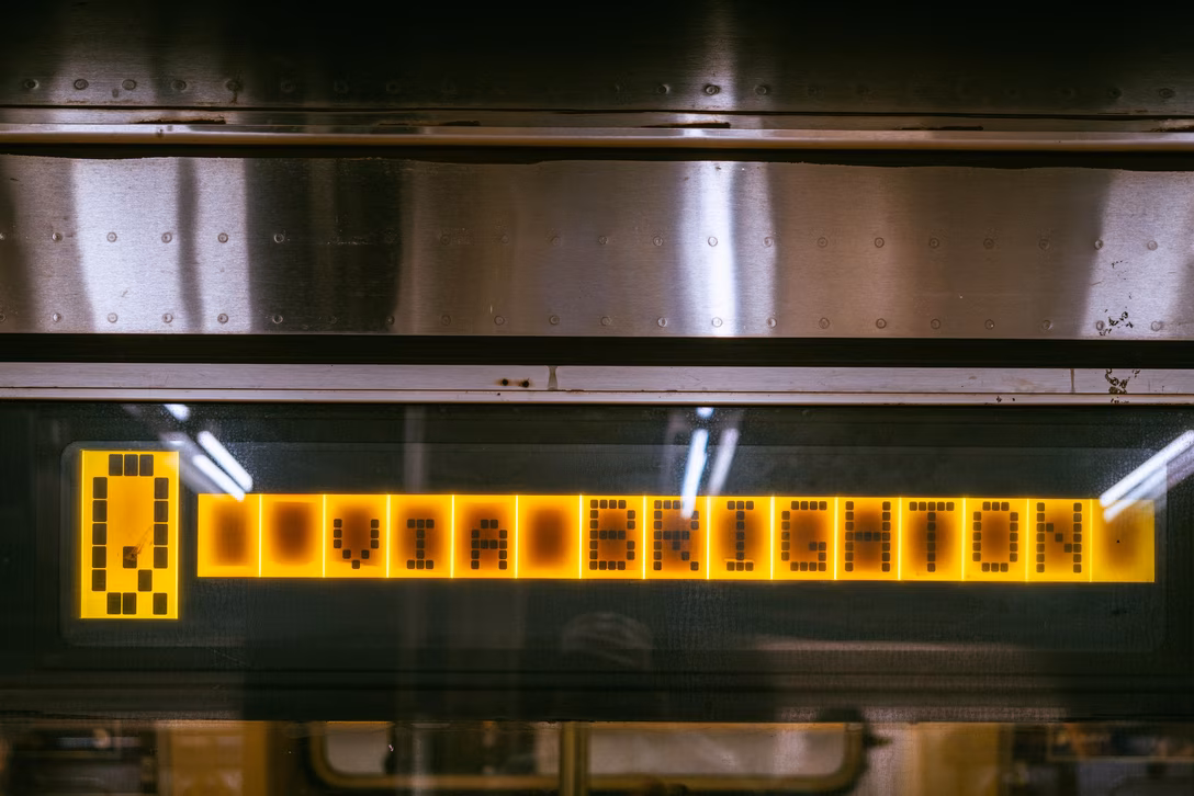
But here’s something even better\. This icon of a stadium cleverly leaned into the same limitations\. It’s so delightful\. These are, I believe, four characters side by side:
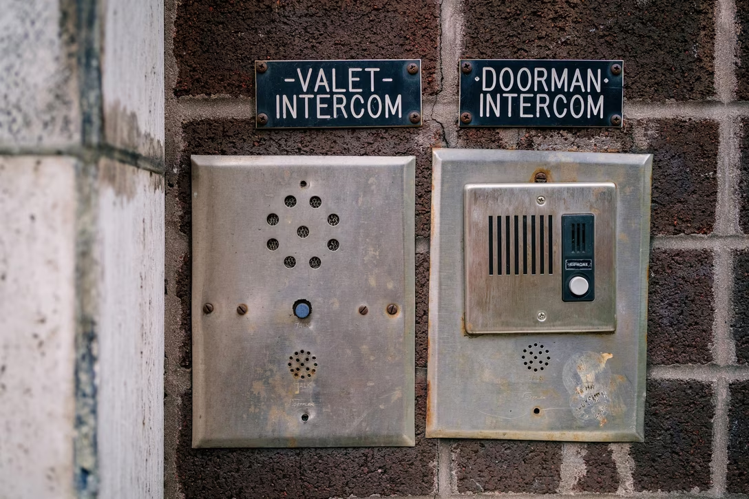
Here, someone added nice decoration to fill out the space:
Here, someone removed all the line height to create a*fascinating*vertical ligature\. This is[Gorton](https://aresluna.org/the-hardest-working-font-in-manhattan/)and the letters are carved into the plastic, so this required some effort\!
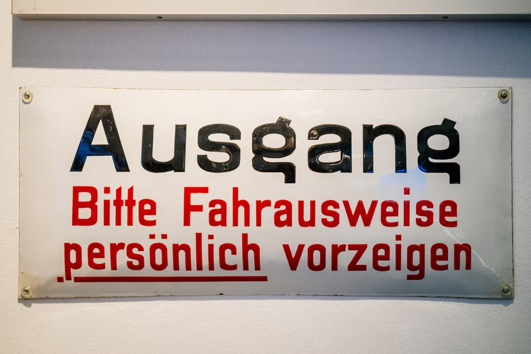
Speaking of obliques, this NOT is too thick, and slightly too large, but you have to appreciate someone actually slanting the text rather than underlining it, or decorating in a simpler way:
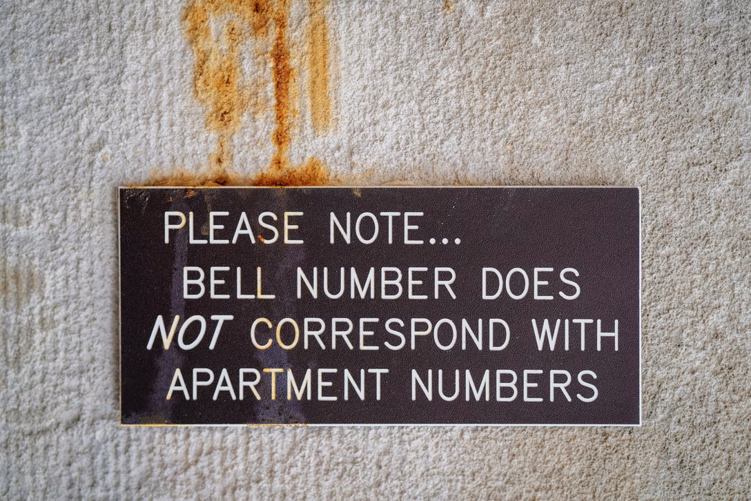Even if you underline, you can go a little… well, below and beyond:
Or, here, with maybe the most impressive, three\-dimensional underline I’ve ever seen:
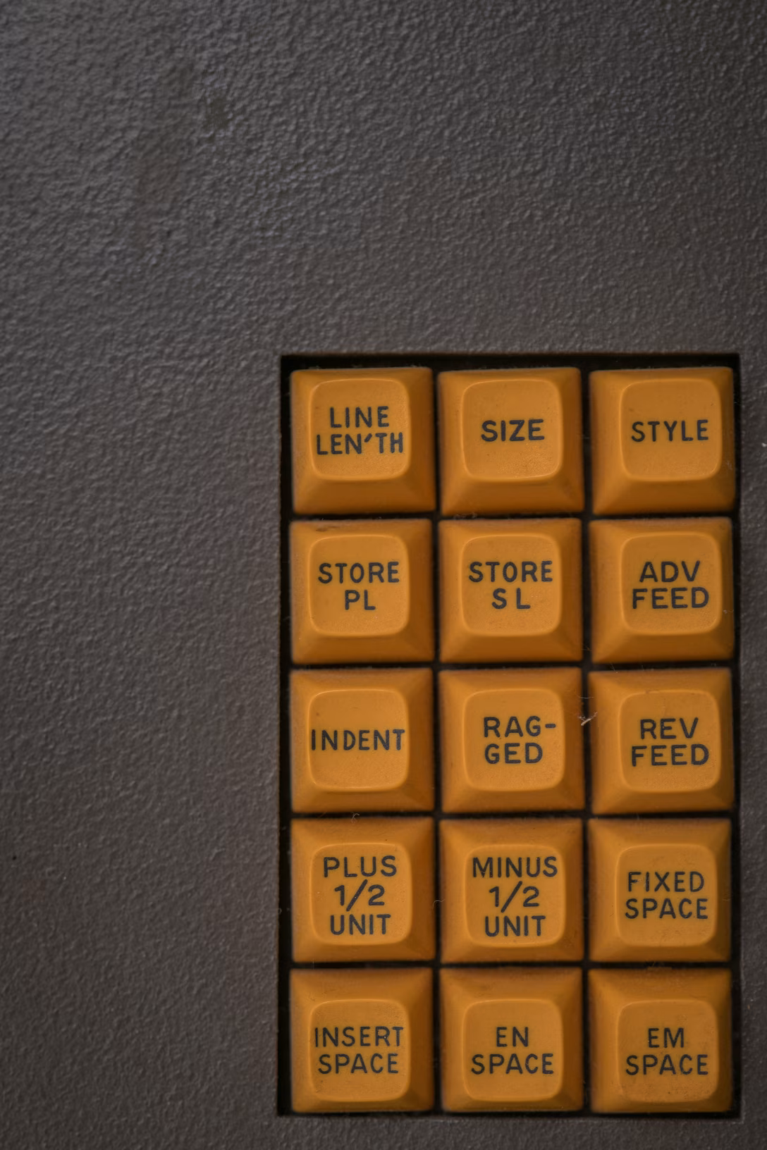
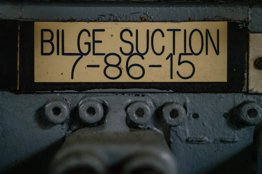
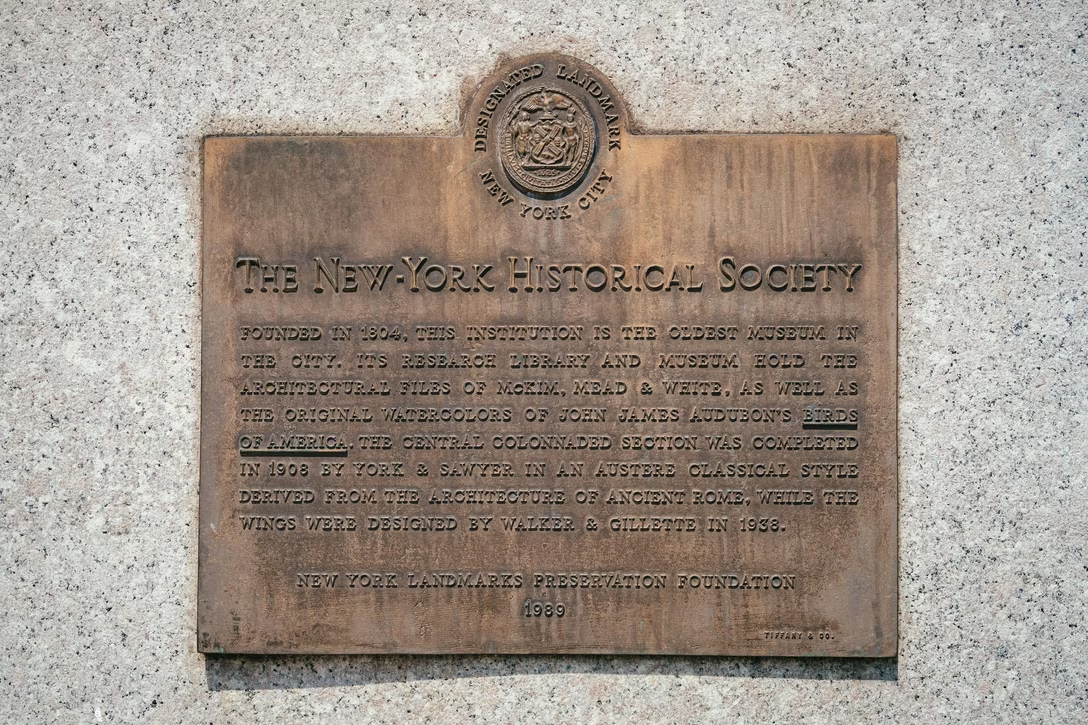This I spotted on an old typesetting machine, and I would like to believe this is an intentional easter egg:
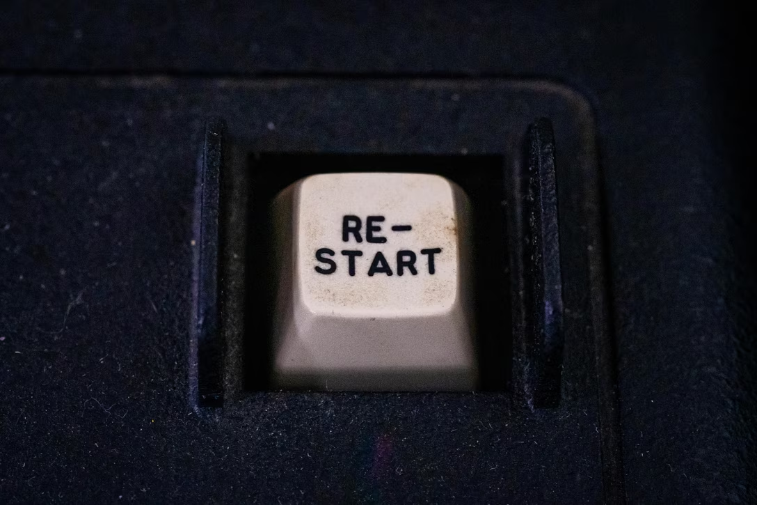
This was on a computer keyboard\. You don’t expect hyphenation in this context…
…and you*definitely*don’t expect an old\-fashioned contraction: