Cached at:
07/12/26, 10:48 AM
# The Proportional Web
Source: [https://owickstrom.github.io/the-proportional-web/](https://owickstrom.github.io/the-proportional-web/)
Inspired by the*The Elements of Typographic Style*
Authored by[Oskar Wickström](https://wickstrom.tech/)\.v0\.1\.0, licensed underMIT\.
## Contents
- [Foreword](https://owickstrom.github.io/the-proportional-web/#foreword)
- [1Foundations](https://owickstrom.github.io/the-proportional-web/#foundations)- [1\.1Typography](https://owickstrom.github.io/the-proportional-web/#typography) - [1\.2Colors](https://owickstrom.github.io/the-proportional-web/#colors)
- [2Elements](https://owickstrom.github.io/the-proportional-web/#elements)- [2\.1Headings](https://owickstrom.github.io/the-proportional-web/#headings) - [2\.2Emphasis](https://owickstrom.github.io/the-proportional-web/#emphasis) - [2\.3Horizontal line breaks](https://owickstrom.github.io/the-proportional-web/#horizontal-line-breaks) - [2\.4Details](https://owickstrom.github.io/the-proportional-web/#details) - [2\.5Asides](https://owickstrom.github.io/the-proportional-web/#asides) - [2\.6Names](https://owickstrom.github.io/the-proportional-web/#names) - [2\.7Blockquotes](https://owickstrom.github.io/the-proportional-web/#blockquotes) - [2\.8Figures](https://owickstrom.github.io/the-proportional-web/#figures) - [2\.9Lists](https://owickstrom.github.io/the-proportional-web/#lists) - [2\.10Tables](https://owickstrom.github.io/the-proportional-web/#tables) - [2\.11Code Blocks](https://owickstrom.github.io/the-proportional-web/#code-blocks)
- [3Usage](https://owickstrom.github.io/the-proportional-web/#usage)- [3\.1Purpose](https://owickstrom.github.io/the-proportional-web/#purpose) - [3\.2Getting started](https://owickstrom.github.io/the-proportional-web/#getting-started)
- [4Related works](https://owickstrom.github.io/the-proportional-web/#related-works)- [4\.1The Elements of Typographic Style Applied to the Web](https://owickstrom.github.io/the-proportional-web/#the-elements-of-typographic-style-applied-to-the-web) - [4\.2Practical Typography](https://owickstrom.github.io/the-proportional-web/#practical-typography) - [4\.3Tufte CSS](https://owickstrom.github.io/the-proportional-web/#tufte-css)
- [Afterword](https://owickstrom.github.io/the-proportional-web/#afterword)
## Foreword
Two summers ago, just before I started working at TigerBeetle, I picked up a new side project during downtime\. I’ve always had a soft spot forCSSbut I don’t know why; frankly, it’s weird, confusing, and infamously error\-prone\. It could be nostalgia from my early days of programming web applications\. Whatever the cause,[The Monospace Web](https://owickstrom.github.io/the-monospace-web/)was born out of that love, and it took off way harder than I ever thought it would, with many personal blogs and even application interfaces having adopted it\.
So, here I am again, spending weekend spare hours in a form of meditative state writingCSS\. This time, inspiration struck after reading Robert Bringhurst’s classic*The Elements of Typographic Style*\. A challenge indeed, trying to implement the layout and typography of the book itself in the browser\. Reckless, some might say\! Surely the same rules don’t apply across print and web, where the latter cannot lean on a fixed page size, but has all the capabilities of a programmable platform\. Perhaps, perhaps not\. I’ve decided to publish regardless, and bid you to take from it what you will; if you find it pleasant or useful, that’s a wonder, and if not, that’s fine\.
Consider this the spiritual and variable\-width sequel ofThe Monospace Web, and equally open for reuse\. I’m a sucker for Pandoc, and that’s what I’ve used to produce this HTML, but the stylesheet should work in many other settings with minor tweaks\.
## Foundations
> Typography is the craft of endowing human language with a durable visual form\.
## Typography
### A single versatile font as the basis of the design
In this document and its design, I’m using two variants of theAlegreyafont\. The regular variant is used for body text and third\-level headings\. Its small\-caps variant,Alegreya SC, is used for titling\-caps top\-level headings, small\-caps second\-level headings, and for inline abbreviations such asHTML\. Finally,Courier Primeis used for monospace code snippets\.
Bringhurst argues in his book for choosing a single versatile typeface rather than a hodgepodge of different ones\. I thinkAlegreyais such a choice, and an excellent one at that\.
### A sizing system built on relative measurements
Every size is based on the root font size, which is 16px\. Sizes are thus given in`rem`units, relative to the root font size\. The following table shows how fractional,`rem`, and pixel measurements correlate\.
aaaaaaaaaaa3/47/819/85/411/83/225/2340\.750\.87511\.1251\.251\.3751\.522\.5341214161820222432404864Standard font sizes in fractional and decimal`rem`units, along with their`px`equivalents\.Sizing everything based on the root font size makes it easy to scale the design, for instance on smaller viewports:
```
@media screen and (max-width: 480px) {
:root {
font-size: 14px;
}
}
```
The line height is 1\.2rem, and is used as the basis for vertical alignment of all elements\. Much like inThe Monospace Web— but not to the same extremes — I’ve tried to get everything globally aligned to multiples of the line height\.
### Justified text in modern browsers
As in Bringhurst’s book, body text is justified, not ragged right\. To some, this is grave heresy on the web\.*Thou shalt not justify\.*That’s what we’ve all been taught\. But browsers have improved over time and today it’s not unthinkable to justify text\. This stylesheet uses`word\-break`,`text\-wrap`, and`hyphens`to control how words are broken and hyphenated at line breaks\. The`hyphenate\-limit\-chars`property is useful to control the bounds of hyphenation\.
The risk is of course getting horrible word spacing and*rivers*of whitespace in your paragraphs\. If justified text doesn’t work for your uses, consider`text\-align: left`instead\. In this document I find that it works acceptably with the line lengths, font size, and the content itself\. I’ve also inserted a few soft hyphens to further guide the word breaks for some tricky words\.
### Indented paragraphs for legibility
In keeping with tradition, each successive paragraph is indented 3ch, which is the width of three 0 \(0x30\) characters\. As an example, the paragraph following this one leads with an indent\.
This lets your eyes more easily scan the structure of the text and find the starts and ends of paragraphs\. We’ve done this in print text for at least half a millennium, and while the web has largely settled on no indent and vertical space between paragraphs, it is still a valid approach\.
## Colors
You may have noticed that this design is devoid of color\. It’s all black on white\. Not only am I personally inclined towards this minimalism in prose\-heavy documents, at least as a strong default that I depart from only with careful consideration, but it’s also what Bringhurst argues in his book, although with print media in mind\. I find it aesthetically pleasing and easier on the eyes, and it reserves the arsenal of color, and thus the attention of the reader, for the most critical things, such as diagrams conveying complex data\.
## Elements
This document uses a few extra classes here and there, but mostly it’s just semanticHTML5markup\. This, for instance, is a regular paragraph\. The examples below are indented for clarity; in normal use they’d span the full width of the text\.
## Headings
The design provides styles for three level of headings: top\-level chapter headings \(`h1`\), section headings \(`h2`\), and sub\-section headings \(`h3`\)\.
## On the theory of war
## Art or science of war
### Usage still unsettled
## Emphasis
There’s no surprise here; text in`<em\>`tags is italicized, just as you’d expect:
Do you think I can stay to become*nothing*to you?## Horizontal line breaks
There’s no clear guidance on horizontal line breaks in Bringhurst’s book, but it seems to me like a good place for ornamentation\. Here’s one:
---
The symbol used is U\+2767Rotated Floral Heart Bulletfrom the Unicode*Dingbats*block\.
## Details
We can hide stuff in the`<details`\> element\. Click the label below:
LicenseCopyright 2026 Oskar Wickström
Permission is hereby granted, free of charge, to any person obtaining a copy of this software and associated documentation files \(the “Software”\), to deal in the Software without restriction, including without limitation the rights to use, copy, modify, merge, publish, distribute, sublicense, and/or sell copies of the Software, and to permit persons to whom the Software is furnished to do so, subject to the following conditions:
The above copyright notice and this permission notice shall be included in all copies or substantial portions of the Software\.
THE SOFTWARE IS PROVIDED “AS IS”, WITHOUT WARRANTY OF ANY KIND, EXPRESS OR IMPLIED, INCLUDING BUT NOT LIMITED TO THE WARRANTIES OF MERCHANTABILITY, FITNESS FOR A PARTICULAR PURPOSE AND NONINFRINGEMENT\. IN NO EVENT SHALL THE AUTHORS OR COPYRIGHT HOLDERS BE LIABLE FOR ANY CLAIM, DAMAGES OR OTHER LIABILITY, WHETHER IN AN ACTION OF CONTRACT, TORT OR OTHERWISE, ARISING FROM, OUT OF OR IN CONNECTION WITH THE SOFTWARE OR THE USE OR OTHER DEALINGS IN THE SOFTWARE\.
## Asides
Bringhurst’s book uses plenty of side notes\. InHTMLwe define those using`<aside\>`elements\. Along with this paragraph there’s a side note\. With a large enough viewport, you’ll see it in the right margin, aligned with the top of the previous paragraph; with a smaller viewport, it’ll be collapsed into an inline paragraph with ornamentation\.
## Names
Proper nouns and canonical names, distinguished using the`\.canonical\-name`class, are rendered as small\-caps much like in the example from Bringhurst’s book:
… on the islands ofLombok,Bali,Flores,TimorandSulawesi, the same textiles …## Blockquotes
Bringhurst talks about various ways of typesetting quotations, and the one I landed on is using an indented block, quotation marks around the text, and a footer with*author*,*work*, and*year*\.
> Je n’ai fait celle\-ci plus longue que parce que je n’ai pas eu le loisir de la faire plus courte\.
## Figures
Images with captions are put in`<figure\>`and`<figcaption\>`elements, respectively\. Similar to blockquotes,*author*and*work*are styled specifically using small\-caps and italic text, and they share the indentation\.
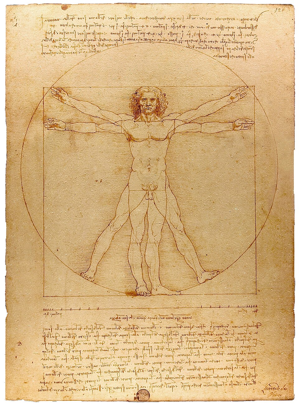Leonardo Da Vinci,Vitruvian Man,c\. 1490, pen and watercolor over metalpoint on paper, 34\.4 × 24\.5 cm \(photograph via[Wikimedia Commons](https://en.wikipedia.org/wiki/File:VitruvianMan_Leonardo_a.jpg)\)## Lists
This is a plain old bulleted list:
- Banana
- Paper boat
- Cucumber
- Rocket
Ordered lists look pretty much as you’d expect:
1. Goals
2. Motivations1. Intrinsic 2. Extrinsic
3. Second\-order effects
## Tables
Tabular data is presented with a strong table head, using small\-caps labels and a border\. Otherwise it’s very simple, relying only on spacing\.
NameDimensionsPositionBoboli Obelisk1\.41m × 1\.41m × 4\.87m43°45′50\.78″N 11°15′3\.34″EPyramid of Khafre215\.25m × 215\.25m × 136\.4m29°58′34″N 31°07′51″E## Code Blocks
This design is geared towards prose, not code\-heavy technical writing, but code blocks and inline code should read well nonetheless\. The font choice ofCourier Primemight feel a bit typewriter\-nostalgic, but I find it goes very well withAlegreyaand the overall feel I’m aiming for\. Here’s some code from the stylesheet:
```
:root {
--font-family: "Alegreya", serif;
--line-height: 1.2;
--border-thickness: 1.5px;
--text-color: #000;
--background-color: #fff;
}
```
## Usage
> Immature poets imitate; mature poets steal\.
## Purpose
This design is meant for web documents comprised mainly of prose: books, journals, blogs, manuals, and the like\. You might use this as a basis for your personal website, a specific project, or maybe a larger wiki\. You probably don’t want it in a dynamic web application\.
Copy or fork what you want, modify it to your heart’s content, but don’t forget proper attribution\. The sources have license information in their headers, so it’s as easy as keeping those around\.
## Getting started
To get started quickly, download[the sources from GitHub](https://github.com/owickstrom/the-proportional-web), put the directory in your project as`the\-proportional\-web`, and add these to the`head`element of your HTML:
```
<link rel="stylesheet" href="the-proportional-web/index.min.css" />
<script src="the-proportional-web/index.js"></script>
```
If you’re using Pandoc, invoke it with some thing like the following set of arguments:
```
pandoc \
--toc --toc-depth=2 \
-s \
--number-sections --number-offset=0 \
--css the-proportional-web/index.min.css \
-V'header-includes=<script src="the-proportional-web/index.js"></script>' \
--no-highlight \
-i input.md \
-o output.html
```
If you do need syntax highlighting, consider using a custom template like the[one used for this HTML output](https://github.com/owickstrom/the-proportional-web/blob/main/src/demo/template.html), stripping away the default CSS included by Pandoc\.
## The Elements of Typographic Style Applied to the Web
The most closely related work that I know of is[The Elements of Typographic Style Applied to the Web](https://webtypography.net/)by Richard Rutter\. It’s a website largely mirroring the structure of Bringhurst’s book, but adapting its advice to web design\. It is much larger in scope and is seemingly focused on the information itself, while this document is a showcase of the ideas and of the stylesheet that isThe Proportional Web\. Furthermore, I had a hard time reading Rutter’s website on my phone, with font sizes varying drastically\. From what I’ve gathered, it dates back at least 20 years, and seems to have had no updates in about 8 years\. I have put a lot of effort into making this design responsive yet consistent across viewport sizes\. In any case, I think it’s fair to say that they serve different purposes and can happily coexist\.
## Practical Typography
Matthew Butterick’s[Practical Typography](https://practicaltypography.com/)is a real workhorse, and goes into sufficient detail on just about everything a layman or typography\-adjacent engineer, like myself, will ever need\. I have come back to it many times over the years\.
## Tufte CSS
[Tufte CSS](https://edwardtufte.github.io/tufte-css/)deserves an honorable mention\. From what I’ve seen, it’s had a big impact and recognition\. There are small details around typesetting that I don’t like in it, but it’s overall a solid piece of work\.
## Afterword
There we have it,*The Proportional Web*\. The methodology of Bringhurst’s book is rich and I highly recommend you read it\. I’ve only scratched the surface in this exposition, and applied and adapted a small subset of his ideas\.
This document was produced using[Pandoc](https://hackage.haskell.org/package/pandoc-cli),[html\-minifier](https://github.com/kangax/html-minifier),[esbuild](https://esbuild.github.io/), and[GNU Make](https://www.gnu.org/software/make/)\. The design borrows heavily, both in ideas and actual layout, from*The Elements of Typographic Style*by Robert Bringhurst\. A big thanks to[U\.S\. Graphics](https://x.com/usgraphics)and[Mikael Brockman](https://x.com/meekaale)for reviewing my drafts\.