Cached at:
09/14/26, 11:06 PM
# A New Equal-Area Map for Interactive Computer Use
Source: [https://www.benjoffe.com/map](https://www.benjoffe.com/map)
**A magic new Y\-value formula:**
See the[full formula](https://www.benjoffe.com/map#formula)for more\.
## Seamlessly transitioning to Mercator upon zoom\(and some new compromise cylindrical maps\)
15 September 2026
Recently the UN passed the non\-binding*"Correct the Map"*resolution which encourages the use of the Equal Earth projection in place of Mercator \(which represents country\-sizes disproportionately\)\.
The Mercator projection is well suited to zoomable/navigation maps due to being "conformal", meaning it represents directions accurately\. At a global scale*Equal Earth*may look pretty good, but it's not what web and mobile based apps typically require\.
I present an alternative\. The map below is*equal\-area*at a global scale, and upon zoom, it transitions seamlessly to the Mercator projection\. It is defined by an unusually simple math formula\. The hybrid nature of the map is baked into the very design\.
Note: the transition states are compromise map projections\. It is equal area only at the global scale, and conformal only once zoomed in\.
In my view*most*countries improve in appearance in the zoomed\-out mode compared to Equal Earth\. An obvious exception is Northern Europe when centred, however I encourage you to pan the map so Europe is on the edge and then compare\. See the[side\-by\-side screenshots](https://www.benjoffe.com/map#screenshots)for more specific examples\.
## The Formula[Deep link](https://www.benjoffe.com/map#formula)
Before discussing the map in more detail, a quick high level overview of the math:
A proof that this produces an equal area map is presented in[Annexure A \- Equal Area Proof](https://www.benjoffe.com/map#proof)\.
In order to transition to the Mercator projection:
- Letbe a variable that scales with zoom from*\(global view\)*to*\(when it completes the transition to Mercator\)*\.
- Let\.
- Let\.
That's it\! A simple closed\-form function in the forward and inverse directions\. By comparison, Equal Earth has many fitted constants and requires Newton's formula to iterate the inverse\.[\(see the definition on Wikipedia\)](https://en.wikipedia.org/wiki/Equal_Earth_projection#Formulation)\.
Not only does it transition to Mercator, but if you letandthen it becomes the[Lambert cylindrical equal\-area projection](https://en.wikipedia.org/wiki/Lambert_cylindrical_equal-area_projection)\!
I\.e\. the pure cylindrical version of this formula interpolates equal\-area and conformal cylindrical maps\. This lends it to generate some very nifty*compromise cylindrical*projections which will be outlined later\.
## Side\-by\-Side Screenshots[Deep link](https://www.benjoffe.com/map#screenshots)
#### United States and Central America
Being off to the side, it is difficult to represent USA and Mexico without distortion\. Slightly less skew occurs in the new map compared to Equal Earth\.
New MapEqual EarthBothTexture
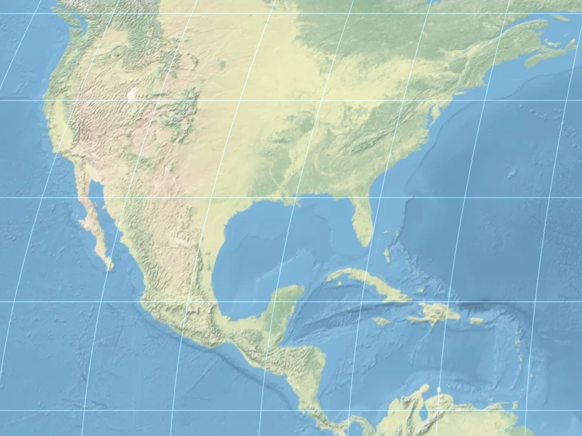
New Map
#### Australia and New Zealand
Also off to the side, it is difficult to represent Australia and particularly New Zealand without distortion\. Slightly less skew occurs in the new map compared to Equal Earth\.
New MapEqual EarthBothTexture
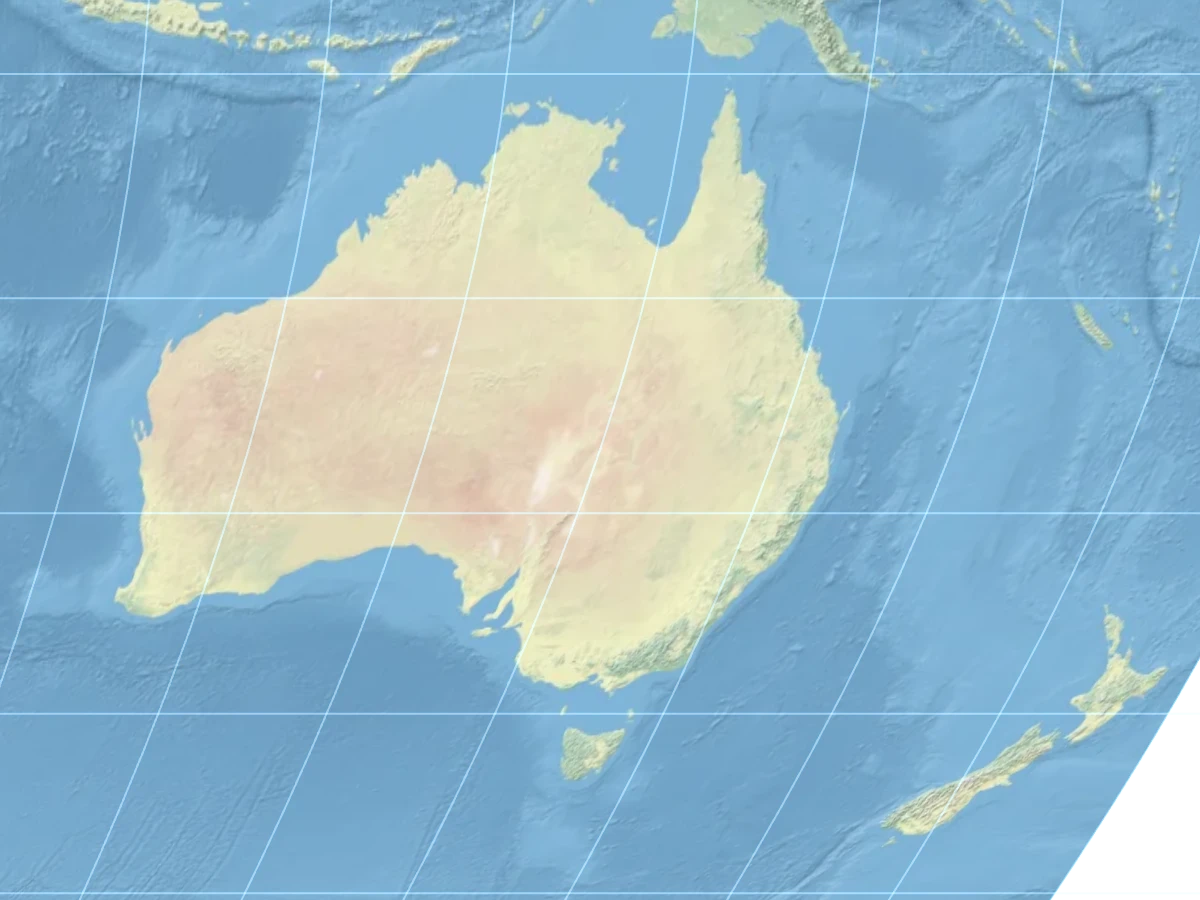
New Map
#### Japan and Korea
North East Asia suffers from the same skew problem, which is distorted less in the new map style\.
New MapEqual EarthBothTexture
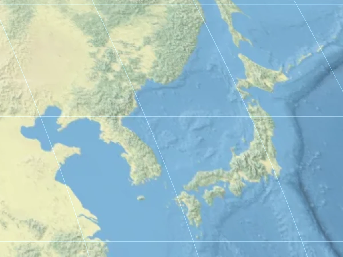
New Map
#### Africa
Equatorial continents like Africa have slightly less vertical stretch compared to Equal Earth:
New MapEqual EarthBothTexture
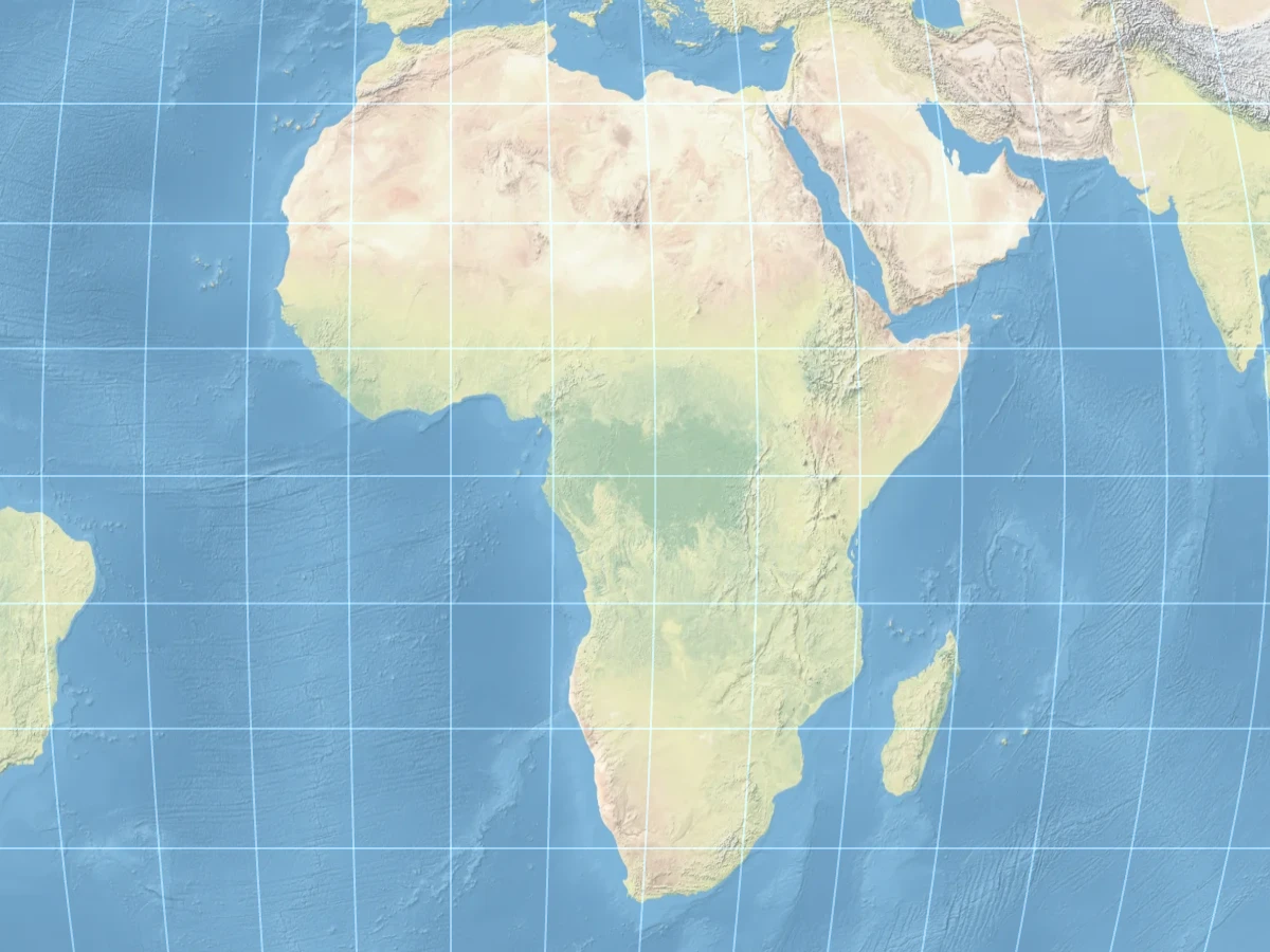
New Map
#### South America
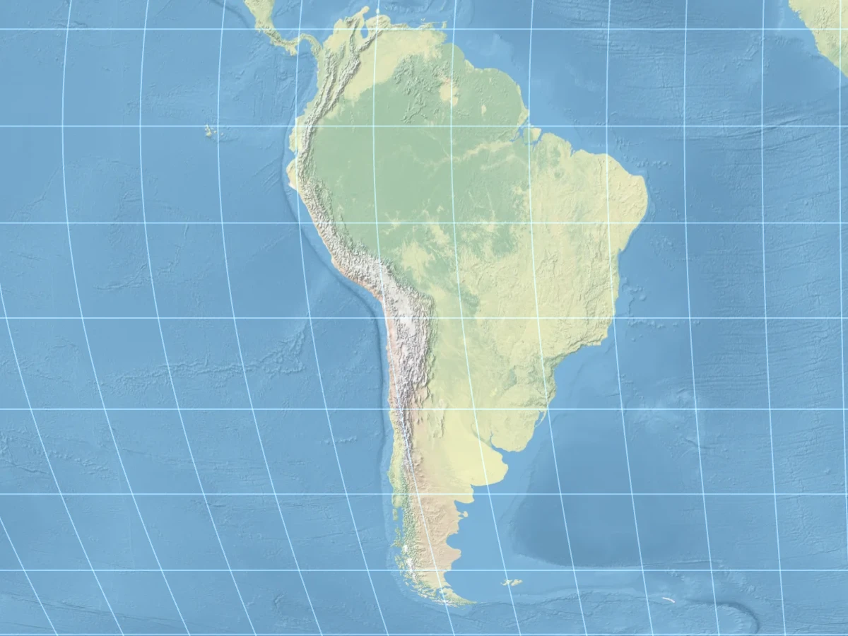
South America is a bit more of a mixed\-bag\. I would argue that the continent on the whole looks better in the new map, while Argentina and Chile have a more natural shape in Equal Earth down in the south\.
New MapEqual EarthBothTexture
New Map
#### Europe
Europe is the main exception to the trend above \(when considering only reasonably populated land masses\)\. It appears quite good in the*standard*Equal Earth map projection\.
Since Europe is so high in latitude, in order to get Europe looking good, one must sacrifice the appearance of other countries by introducing a high degree of curvature\. In my view, Europe is already "lucky" in that it overlaps the prime meridian, so putting extra emphasis on a good\-looking Europe at the expense of other countries feels a little lopsided\.
The points above hold only for a static map\. Once the map is rotatable, a high curvature becomes a disadvantage\. The images below show how the flatter, lower\-skew layout creates a more recognisable Europe when panned to the edge:
New MapEqual EarthBothTexture
## Why These Constants\(a & b\)[Deep link](https://www.benjoffe.com/map#constants)
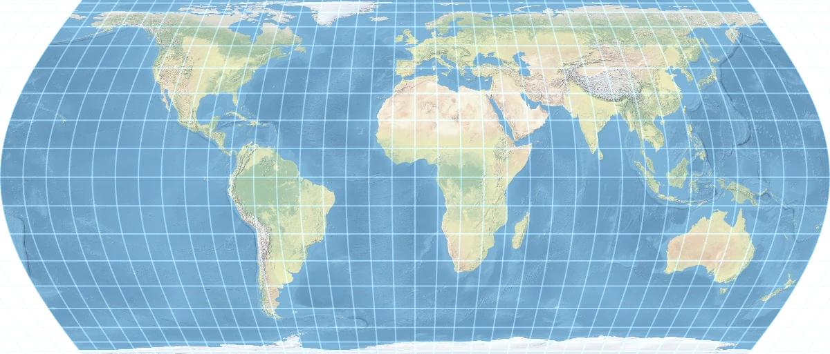
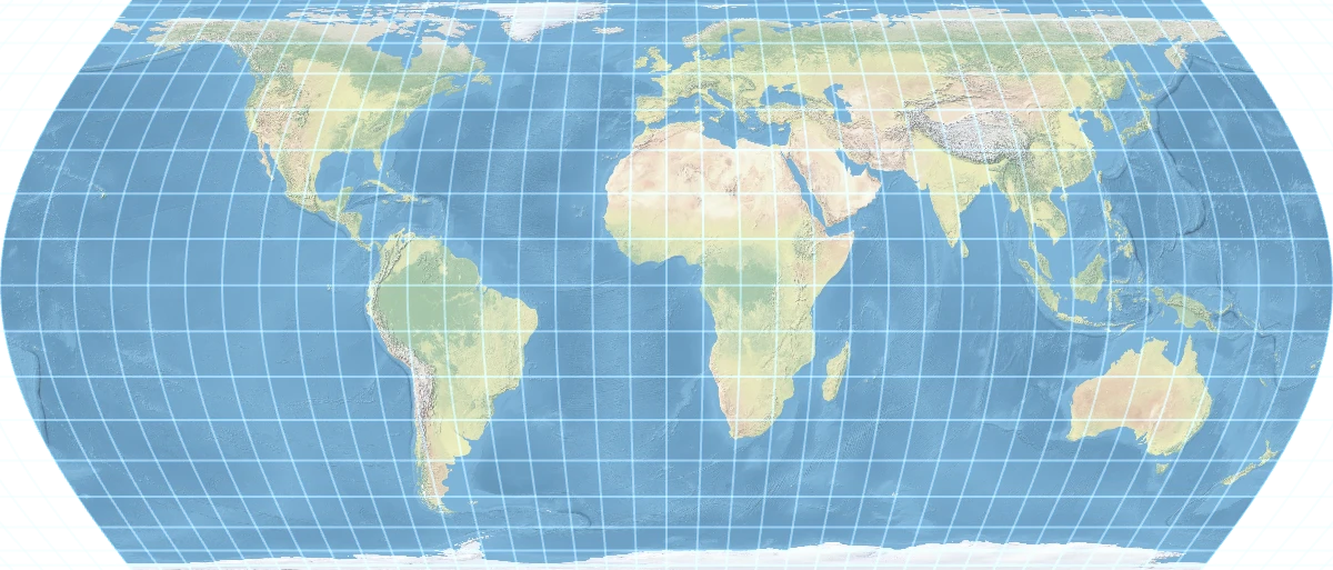
There are two constants chosen in the formula:and\. These have been selected from trial and error as values that, in my subjective opinion, look the best\. Others may certainly disagree, especially perhaps preferring a smaller value of\. Any chosen values will retain the equal\-area property\.
Below is a sense of how each constant moves the map\. The middle column of each row is the value actually used; the columns either side show it nudged down and up\.
3\.5/94/94\.5/9AllTexture
3\.5/54/54\.5/5AllTexture
## Compromise Cylindrical Projections[Deep link](https://www.benjoffe.com/map#cylindrical)
As noted previously, the general formula for latitude in the new map interpolates equal\-area and conformal cylindrical maps\.
Here is the same interactive map presented at the start of this article, but instead of an equal\-area map, it is a compromise cylindrical projection which tweens to the Mercator upon zoom\.
The map above uses the exact same formula as the equal\-area one, but with no horizontal axis distortion, only the value of a is tweaked as the zoom\-level changes\.
To see how this`a`variable behaves, in the UI below the compromise\-cylindrical parameteris exposed directly: drag the slider, or scroll/wheel over the map itself\. The map is a fixed square — asapproaches 1 the poles simply run off the top and bottom edge, landing on a square, pole\-truncated Mercator at the limit\.
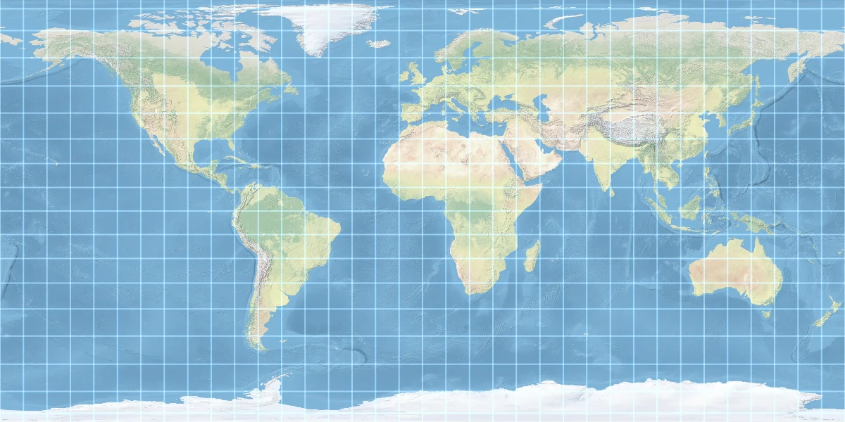
I would like to call out two specific aspect ratios as being interesting to me, shown below\. They can each be compared to similar map projections of the same aspect ratio:
### Domino \(2:1\)
New MapEquirectangular
Texture
New Map
New MapEquirectangular
Texture
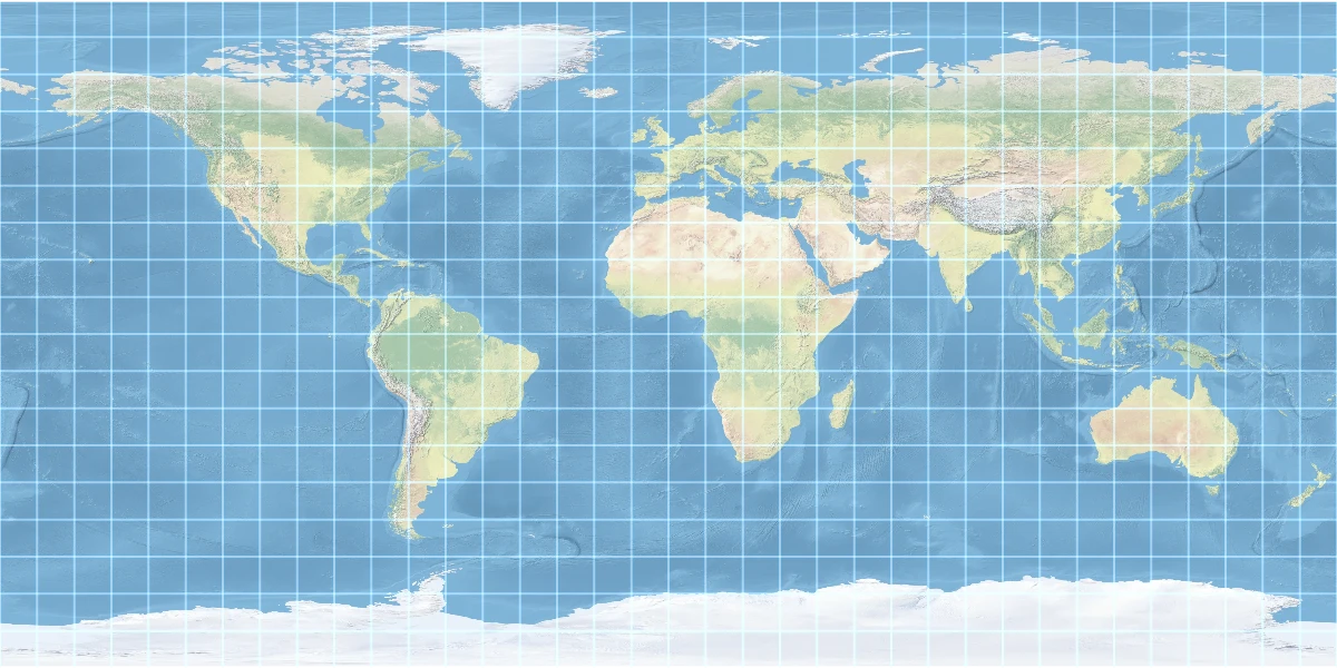
Equirectangular
*a = 0\.882251819\.\.\.*
### Golden Rectangle \(Φ:1\)
New MapAspect\-Adaptive Miller
Texture
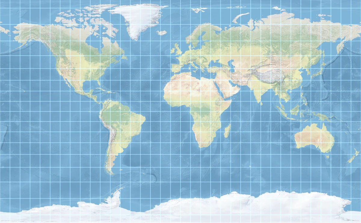
New Map
New MapAspect\-Adaptive Miller
Texture
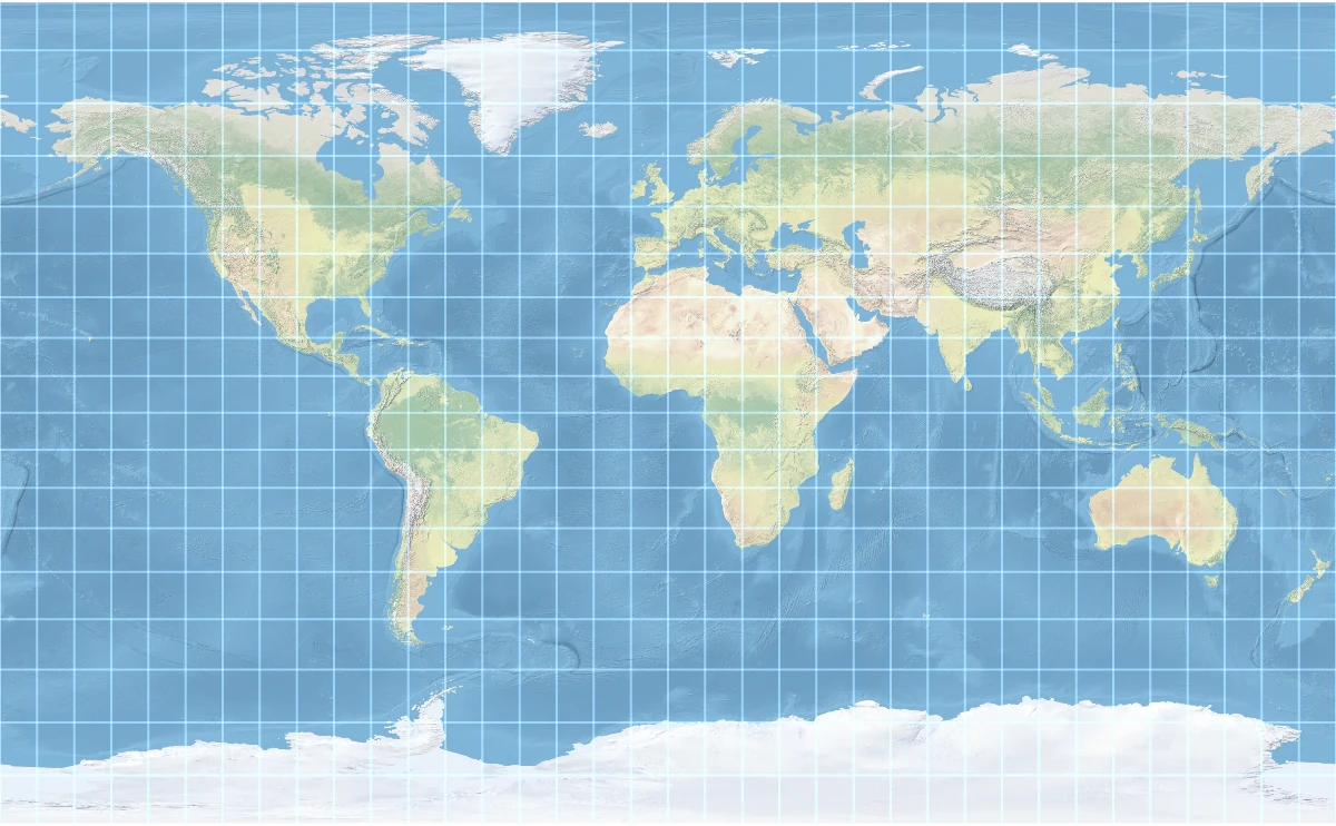
Aspect\-Adaptive Miller
*a = 0\.951505567\.\.\.*\*Aspect\-Adaptive Miller is the version of the "Compact Miller Cylindrical" in cases where the aspect ratio is not 1:0\.6\.
The new map style wastes considerably less space on the Arctic and Antarctic regions\. Only around 0\.3% of the globe lies north of Greenland, yet most compromise cylindrical projections dedicate 3–5% screen space to it; doing so helps Norway and Iceland look a little more natural\. Greenland looks a little flatter on top, but if you've ever looked at Greenland on an actual globe, you'll see that none of these maps represent it well\. A conic or polar azimuthal map is required for reasonable representation of Greenland\.
Drag to pan · Scroll or pinch to zoom
## Formulas for the Ellipsoid[Deep link](https://www.benjoffe.com/map#why)
The formulas presented are modelled for a spherical Earth, just as is the case for "Web Mercator"\. Maps that model the ellipsoidal Earth can be easily supported by tweening from[authalic latitude](https://mathworld.wolfram.com/AuthalicLatitude.html)to[conformal latitude](https://mathworld.wolfram.com/ConformalLatitude.html)prior to projection\.
I plan to expand on the mathematical properties of this projection in a future blog post\.
## How and why I made this[Deep link](https://www.benjoffe.com/map#why)
Map projection design is certainly a niche hobby\. Too mathematical to be of interest to many map nerds\. Too constrained and ugly to be of interest to many mathematicians\.
Well, the thing that led to this rabbit hole was actually me just wanting a nice 2:1 aspect ratio map for the world, that showed country shapes well\. I was surprised that I could not find any such map projection to meet my needs\.
The simulation to the right is the content that I wanted that 2:1 map for\. It is a representation of how a boat travelling west, circling the world roughly once every 37 days, will keep an identical clock to a person on Mars\. This visualisation was intended for use in my[article about time on Mars](https://www.benjoffe.com/smoitus), however I never ended up including it as I ended up making that page static so it could be shared as a PDF\.
When searching for the math that would create this look I wanted, it was clear to me that it needed to be similar to Mercator near the equator, and similar to an equal\-area map near the poles\.
After looking at the definition of the Mercator projection, I could see it was usually defined in terms of log and tan, but one definition usually further down the list stood out to me: the`atanh sin x`version\. This definition is perfect because within it lies the function for equal area:`sin x`\. Scaling this function down, and then back up again \(after atanh\), is a fairly simple way to create this tweening function\.
## Novelty[Deep link](https://www.benjoffe.com/map#novelty)
This is certainly not the first aspect\-adaptive map projection, in fact one of the examples above referred to "Aspect\-Adaptive Miller", which can also adapt to various aspect ratios\. What I think is novel is the combination of algorithmic simplicity and aesthetic result\.
People have tried to create a more "tame" version of the Mercator projection by doing some kind of interpolation, whether that's interpolation of*Mercator*to*Equirectangular*\(see[Miller Cylindrical Projection](https://en.wikipedia.org/wiki/Miller_cylindrical_projection)\), or linear interpolation of*Lambert cylindrical equal\-area*to*Mercator*\(see[Arden\-Close Cylindrical \(1947\)](https://map-projections.net/single-view/arden-close)\)\. Such interpolations usually leave the polar regions much larger than desired, leading to later "workarounds" like the "Compact Miller", which attempt to flatten the poles through specific mathematical tweaks layered on top\.
A more flexible way of blending projections was outlined in*[Blending world map projections with Flex Projector](https://ir.library.oregonstate.edu/downloads/707959173)\(Jenny and Patterson, 2013\)*\. The tool discussed in the paper allows tweaking and blending map projections in realtime, a tool which was used by the same authors along with Bojan Šavrič to create the Equal Earth projection in 2018\. Jenny also published a related but distinct paper on[Adaptive Composite Map Projections](https://www.researchgate.net/publication/260582977_Adaptive_Composite_Map_Projections)\.
Mapbox has had[Adaptive Projections](https://www.mapbox.com/blog/adaptive-projections)since 2021, allowing on\-the\-fly transitions between map projections\.
Others have come up with ways to blend Lambert cylindrical equal\-area and Mercator in mathematical non\-linear ways\. See[Revolvable Indoor Panoramas Using a Rectified Azimuthal Projection](https://arxiv.org/pdf/1206.2068)\(Fong, 2012\)\. See the section: "A2\.3 A Blended Cylindrical Map Projection"\. The formula presented in the paper is significantly more complex than the one presented here, and the paper states*"the inverse equation for this projection is particularly gnarly"*\.
The formula`atanh\(sin\(lat\)a\)/a`is so simple it's hard to imagine I'm the first to use it\. I have dug through Snyder's seminal work "Map projections: A working manual", as well as his book "Flattening The Earth" and found no reference to this formula \(as well as online search, and LLM queries\)\. Nonetheless, I put this out in the world now, and if somebody knows of this formula being used in a prior map projection I would be happy to hear of it and update this page accordingly\.
## Annexure A – Equal Area Proof[Deep link](https://www.benjoffe.com/map#proof)
Writefor latitude andfor longitude\. At\(before the Mercator tween\) the projection is:
A projection is equal area if every small patch of the sphere lands on the map with its area multiplied by the same constant\. So take a tiny patch spanningof latitude andof longitude, and compare its area on the sphere with its area on the map\.
### On the sphere
On a unit sphere the patch istall, andwide, because circles of latitude shrink bytowards the poles:
### On the map
The limit of the shape on the map will be a rectangle or a parallelogram because the projection draws horizontal lines of latitude\. Either shape's area can be obtained from width × height \(vertical rise\)\.
**Width:**Along a line of latitude,is fixed andis simplytimes a constant, so:
**Height:**depends only on, so the height is\. Usingand the chain rule:
**Area:**Width × Height; thefactors cancel:
This is exactlytimes the area on the sphere, wherever the patch sits\. So the projection is equal area, with a uniform scale factor of\.
Notice thatcancelled out entirely: any value ofgives an equal area map\. It controls the shape of the map, not its area properties\.
## Next Time
This is just the first of several map related articles I will be publishing over the coming months\. A future post will explore the geometric*meaning*of projecting a map this way, including how it can be applied to*conic*map projections, leading to maps that look a little like the one to the right\. This is a custom map projection I have had on my law firm website \(my day job\) \- National Probate and Estates Group\. I suspect this is the only law firm in Australia with a custom map projection\!
Notice how the lines of latitude are curved, but the states still appear nearly rectangular?
If you would like to be notified when these articles come out,[follow me on X](https://x.com/benjoffe)
---
Revision history:
- 15 September 2026 \- First release