Cached at:
06/29/26, 02:00 AM
# Deciphering basmala
Source: [https://blog.plover.com/lang/bismillah.html](https://blog.plover.com/lang/bismillah.html)
Tue, 23 Jun 2026[Deciphering basmala](https://blog.plover.com/lang/bismillah.html)
Making the rounds last week was this magnificent article on the complications of Arabic typesetting,[An interactive introduction to the terrific experience of rendering Arabic typography and its technical debt](https://lr0.org/blog/p/arabic/)\. The author, Saleh, promises:
> The reply took and the closure of the ticket took half an hour or so\. The reasons behind it took five hundred years to pile up, and they involve a twice\-mutilated vizier, a Qurʾān that vanished for four centuries, a Beirut newspaperman with a deadline, and an Egyptian physician who taught himself font engineering for fun \(or that what I imagine about him\)\. Walking through these, ended up to be the most enjoyable couple of weeks in that job, and I want to go through it here too\.
And then wow, does it deliver\. Don't read my article, go read Saleh's instead, or at least read it first\.
---
Still here? Then a disclaimer: I do not know Arabic, not even all the letters, yet\. I tried hard to get the details right in this article, but I expect there are misspellings, misstatements of fact, and so on, for which I apologize in advance\.
In one of my favorite parts of his article, Saleh discusses how, because Arabic script is always cursive, it is important how the letters are joined to one another\. Modern Latin script has only a few ligatures, and omitting them is barely noticeable:
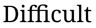 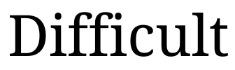
But in Arabic, the ligatures are important\. The text looks grossly wrong without the correct ligatures\.
Early font engines couldn't render Arabic ligatures properly, and on\-screen Arabic text always came out looking ridiculous, with the letters separate like Latin script letters, which is completely wrong for Arabic\. Saleh gives this example, which says “hello, world, this is Arabic text”\. It should look like this:
مرحبا بالعالم، هذا نص عربي
But early font renderers rendered it like this:
مرحبا بالعالم، هذا نص عربي
The crappy rendering was unfortunate, and only barely tolerable, just barely better than nothing\. Even if you don't read Arabic \(I don't\) you can see the differences\. Notice, for example how the elegant and symmetric cluster لعا is mangled to لعا\. Or look at just the first \(rightmost\) letter\. It is the Arabic letter ‘m’, called*mīm*\. It is supposed to connect with the letter next to it, and not to have that hanging tail, which only appears when*mīm*is written by itself, or at the end of a word\.
For the supremely important phrase
بِسْمِ ٱللهِ ٱلرَّحْمَٰنِ ٱلرَّحِيْمِ
the crappy rendering was*not*tolerable\. This phrase is “bismillah al\-raḥman al\-raḥim”\. It means “in the name of God, the gracious, the merciful”, and it appears at the start of each of the 114 surahs \(chapters\) of the Qur'an \(except the ninth for some reason\)\. There is a centuries\-long tradition of calligraphic expression of this phrase, in the most perfect possible ways\.
[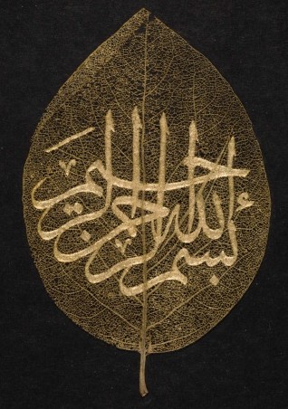](https://pic.blog.plover.com/lang/bismillah/Khalili-leaf.jpg)
“Khalili Collection Islamic Art cal 0154", Ottoman Turkish, 19th century\. Public domain, via[Wikimedia Commons](https://commons.wikimedia.org/wiki/File:Khalili_Collection_Islamic_Art_cal_0154.jpg)\.
It would be blasphemous to render this phrase, called the “basmala”, this crucial expression of honor for God, as a jumble of letters\. Imagine if Exodus 20 had had God introducing the Ten Commandments by saying
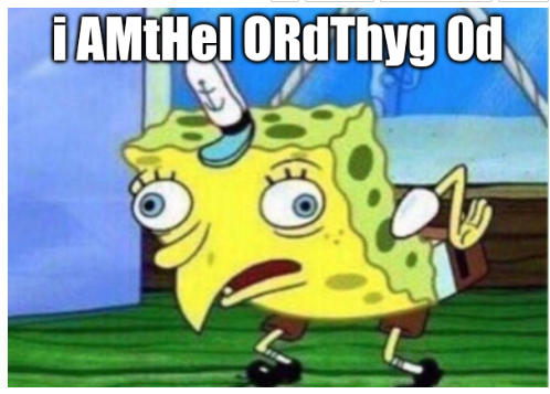
The incredible solution to this one problem was the inclusion in Unicode of a special codepoint U\+FDFD`ARABIC LIGATURE BISMILLAH AR\-RAHMAN AR\-RAHEEM`\. As a single codepoint, the basmala could be assigned a single glyph, and the single glyph could be designed correctly, so as not to look like trash\. Here it is\. Remember, this is a*single*character:
﷽In Firefox, with my fonts, the glyph renders like this, long and narrow:

but on my Android phone there is a very different glyph\. Here it is, highly magnified:
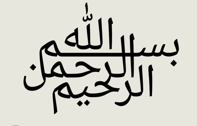
What's going on here? It's fun to find out\.
The basmala actually has four words \(“bismillah” is a contraction\):
1. Bismi \(بسم, “in the name of”\)
2. Allah \(اللّٰه, “God”\)
3. al\-raḥman \(الرحمن, “the gracious”\)
4. al\-raḥim \(الرحيم, “the merciful”\)
\(At some point I should slip in that when the word “al\-” \(which means “the”\) appears before an /r/ sound, its /l/ is assimilated, so that it is pronounced like /ar\-/\. This is analogous to what happens when the English prefix “in\-” is attached to a word like “relevant”\. “Inrelevant” is tricky to say\. so the /n/ is assimilated and the word is spelled and pronounced “irrelevant”\.\)
Here are the four words picked out in different colors\. To a person literate in Arabic, I suppose this is obvious, but I found it a bit challenging\.
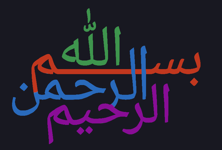
“Allah”اللهis at the top\. \(I'm told this is traditional\.\) I've colored it green because green is said to have been Muhammad's favorite color\.
The two marks above it, the W\-shaped mark and the vertical stroke above it, are diacritic marks \(one called a[shaddah](https://en.wikipedia.org/wiki/shaddah)and other other indicating the vowel\)\. I'm not sure how optional they are, but in an earlier draft of this article I tried to explain them in detail and got bogged down in a multi\-paragraph digression about the morphology of the word “Allah”, so I'm just going to move on without commenting on them further\.
Below “Allah”, in red, is “bismi”\. In Arabic this has three letters, /b/ \+ /s/ \+ /m/, since the vowels are omitted\. At the right we haveبسwhich is /b/ \+ /s/; the letters are named*bā'*and*sīn*\. Then there's a horizontal stroke, called a[kashida](https://en.wikipedia.org/wiki/kashida), under “Allah”; this is just for layout, analogous to white space, and is not pronounced\. Finally theم\(/m/, called*mīm*\) over on the left\.*Mīm*مhas a long tail when it appears at the end of a word, as here, and the designer has decided to attach the tail to theن\(/n/,*nūn*\) at the end of al\-raḥma**n**\. You can see the same finalم*mīm*and its tail at the end of the purple word al\-raḥi**m**, and in the middle of the blue word al\-raḥ**m**an without the tail\.
\([Khaled Hosny](https://khaledhosny.com/), designer of the widely used[Amiri](https://en.wikipedia.org/wiki/Amiri_%28typeface%29)font,[told me that the design of Android basmala glyph is very bad](https://typo.social/@khaled/116752857475379426)\. One of his criticisms was “the bizarre fusion of the letters” and I suppose the attachment of theمand theنis one of the things he had in mind\. He also objected to the insertion of “Allah” into the middle of “bismi”\.\)
The third word, in blue, is al\-raḥmanالرحمنwhich as you can see starts with the same letters as al\-raḥimالرحيم\. You can also see the same first two of those letters at the start of “Allah”الله\. As I mentioned before, “al\-” means “the”, so you see it at the beginning of many Arabic words\. It also survives in many English words that are descended from Arabic, such as alcohol, alcove, algebra, algorithms, and alchemy\.
\(Not, however, “alligator”, where the “al\-” is the*Spanish*word for “the”\.\)
The /r/ sound in al\-raḥman and al\-raḥim is made by the letter*rā'*, which is written as the down\-hanging hook to the left of the ال, as here: الر\. The designer has connected the hook of the blue*rā'*with the upper part of a purple letter called*ḥā'*\. \(I suppose Hosny also dislikes this\.\) When written by itself*ḥā*looks like this: ح but when it's in the middle of a word it loses its fancy tail\. The*ḥā*is of course the common*ḥ*in both al\-ra**ḥ**man and al\-ra**ḥ**im\.
Let's see, what else? The only letter I haven't mentioned is the fifth letter in al\-raḥimالرحيم, just before the*mīm*and its tail, called*yā'*\. When by itself, it is written ي, but in the middle of a word like al\-raḥim, it is the upward\-pointing spike with two dots below\.
Arabic writing is very beautiful, isn't it? Last time I tried to learn the alphabet I got stuck because I was trying to learn the sounds at the same time, and Arabic sounds are very different from English sounds\. Arabic has three sounds that resemble English /h/\. One is very soft, one is very rough, and one is in between\.*Ḥā'*ح is the in\-between one, represented in English as ‘ḥ’\. The soft one,*hā'*, is the last letter inاللهAllah\. Arabic also has a glottal stop, which is a sounds rarely used in English, but I have some practice saying it because it's the apostrophe in “Hawai'i”\.
[Wikimedia Commons has a gallery of basmalas](https://commons.wikimedia.org/wiki/Category:Basmala_in_Arabic_calligraphy), and web search produces thousands more\. I am looking forward to understanding more of them\.
*\[[Other articles in category /lang](https://blog.plover.com/lang)\][permanent link](https://blog.plover.com/lang/bismillah.html)*